MMI WEBSITE
Redesigning an Academic Website to Make Orientation Clearer for Future Students
MMI Website is a university project created for the Multimedia and Internet Professions program at the IUT Gustave Eiffel.
The objective was to redesign the program's website to help future students better understand the training, especially during their orientation process on Parcoursup.
The original experience made information difficult to access, with scattered content, unclear navigation, and limited visibility on what students actually learn throughout the program.
Our challenge was to create a clearer, more engaging, and more accessible website that could modernize the image of the program while making orientation easier for future applicants.
Mission
As part of a team of four, my mission was to contribute to the UX/UI design and front-end development of a redesigned website for the BUT MMI program.
I participated in the research phase, interface design, prototyping, front-end integration, and the development of interactive elements using JavaScript.
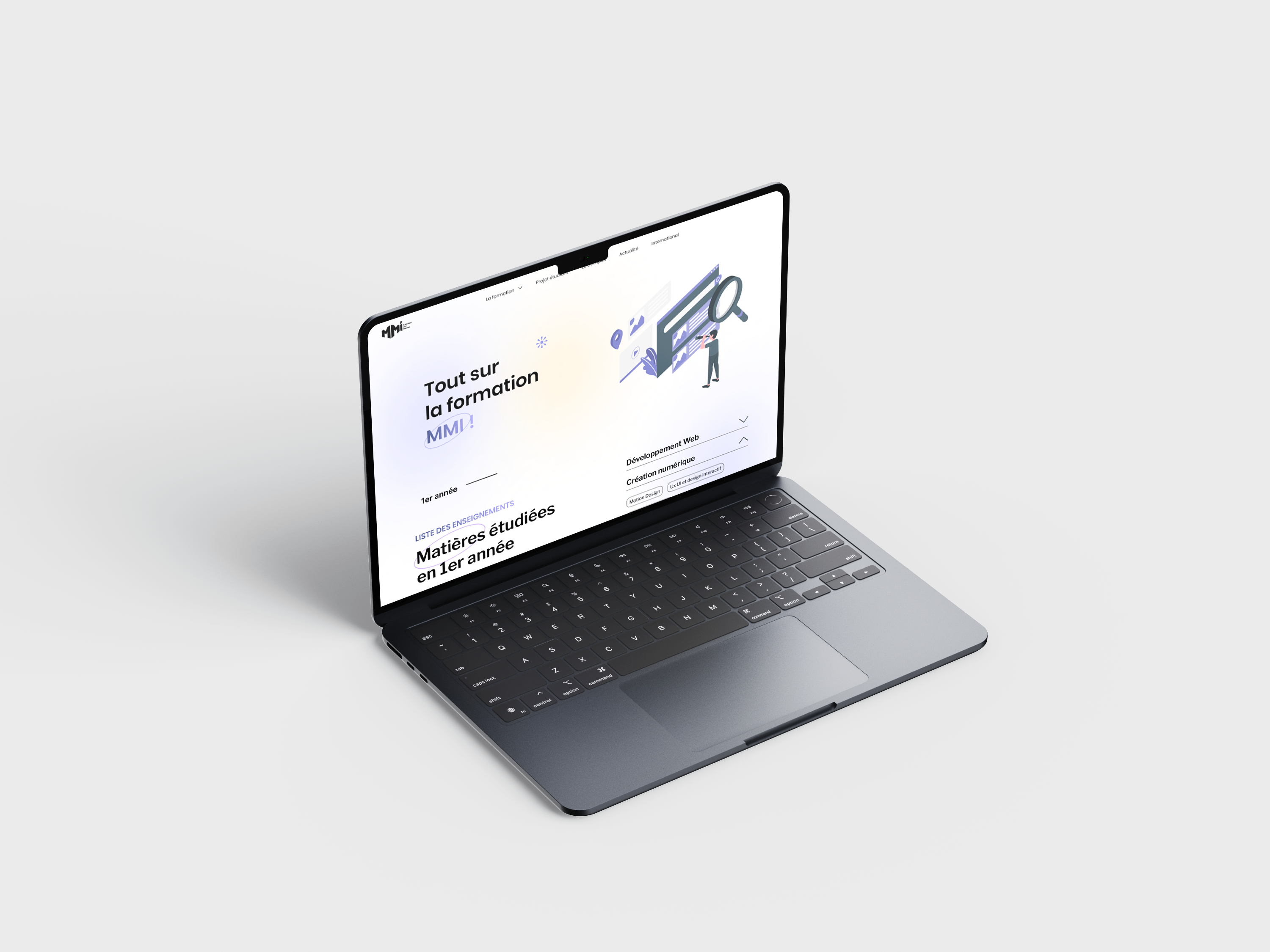
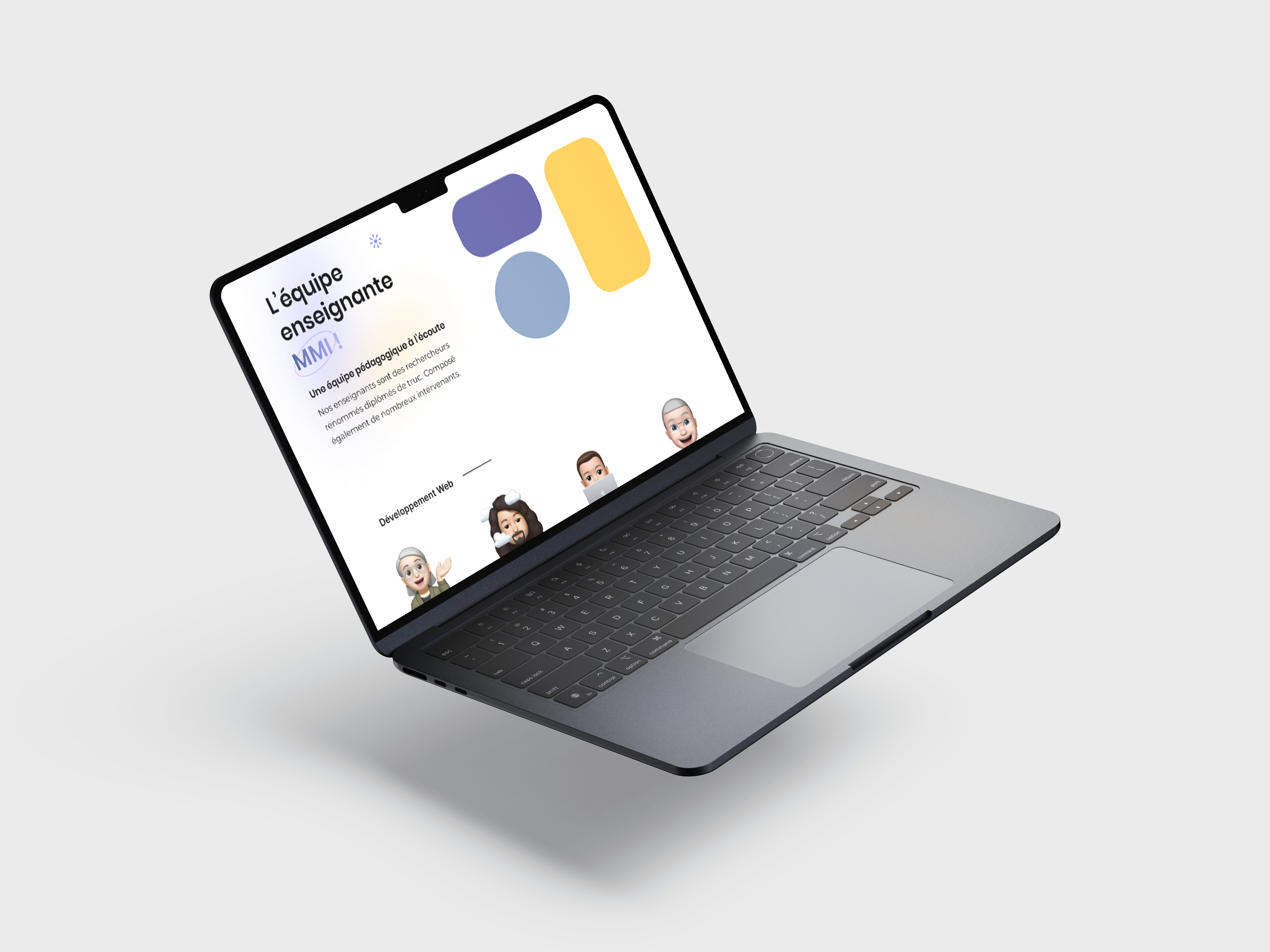
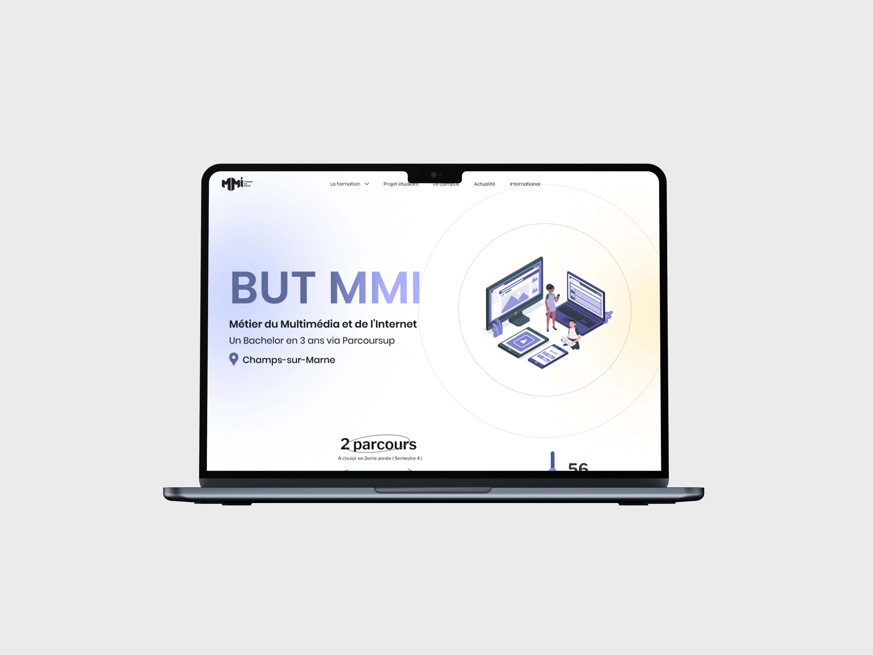
The project included several key pages, including: Home, Program Details, Teaching Team, News, Student Projects, After MMI, Campus, International, and About Us.
Objectives
01 | Clarify the Training Offer
Help future students quickly understand what the BUT MMI program is, what they will learn, and what opportunities it can lead to.
02 | Improve Orientation Support
Create a more useful experience for students looking for information during their Parcoursup decision-making process.
03 | Modernize the Program's Image
Design a more dynamic, colorful, and engaging interface aligned with the creative and digital identity of the MMI program.
04 | Make Information More Accessible
Reduce confusion by improving navigation, content hierarchy, and the visibility of important information.
Strategic Value
01 | Support Student Decision-Making
Give future applicants the right information at the right time to help them make a more confident orientation choice.
02 | Strengthen Transparency
Make the program more understandable by clearly presenting courses, projects, career paths, international opportunities, and campus life.
03 | Reflect the Spirit of MMI
Create a digital experience that feels creative, accessible, and representative of a program focused on web, design, communication, and digital media.
The Challenge
Future students often need to compare several programs while navigating large amounts of information during their orientation process.
However, the existing website made this process more difficult:
Information was difficult to access
Content was scattered across different pages
Navigation lacked clarity
The program's concrete projects and skills were not visible enough
Students struggled to understand what they would actually do in the program
The challenge was therefore both informational and experiential:
How might we redesign the BUT MMI website to help future students understand the program more easily, while making the experience more engaging and representative of its creative identity?
Research et Exploration
The project started with a research phase focused on understanding how future students search for information and what they need before choosing a program.
Methodologies
User Interviews
Eight user interviews were conducted to understand the expectations, doubts, and information needs of future students during their orientation process.
User Testing
Ten user tests helped us identify navigation issues, unclear content areas, and friction points in the existing experience.
Guerrilla Testing
Quick testing sessions were conducted with IUT students to collect spontaneous feedback and validate early design directions.
Wireframing
Low-fidelity wireframes were created to restructure the website, organize key content, and define the main navigation paths.
High-Fidelity Design
High-fidelity mockups were designed in Figma to translate the new structure into a colorful, soft, and visually engaging interface.
Front-End Development
The website was developed using HTML, CSS, JavaScript, and PHP, with interactive elements such as animations and filters.
Key Insights
User Problems Identified :
Students did not always know where to find the right information
The program content was not concrete enough for future applicants
Navigation felt confusing and slowed down exploration
Information about projects, careers, and campus life needed more visibility
The website did not fully reflect the creative nature of the program
Design Opportunities :
Create a clearer navigation structure
Highlight student projects to make the program more tangible
Improve transparency around courses and post-degree opportunities
Use a more colorful and engaging visual identity
Make the experience more accessible for students comparing programs
Design Direction
The visual direction was designed to feel colorful, soft, and creative.
Since the MMI program combines design, communication, development, and digital media, the interface needed to reflect both creativity and clarity.
The design uses pastel colors, many visuals, SVG illustrations, clear content blocks, and a friendly interface to make the website feel more welcoming and easier to explore.
The goal was to create a website that could reassure future students while giving them a concrete understanding of the program.
Core Pages
Program Details
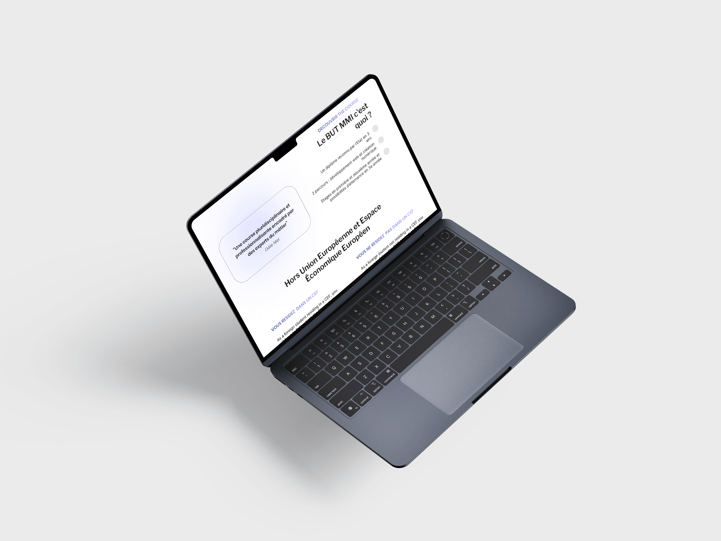
A dedicated section explains the structure of the BUT MMI program, its courses, and the skills students develop.
Student Projects
Projects were highlighted to help future applicants better understand what students actually create during the program.
After MMI
This page clarifies post-degree opportunities, including further studies and professional paths.
Campus & International
These pages give visibility to student life, campus environment, and international opportunities.
Technical
Implementation
The website was developed using HTML, CSS, JavaScript, and PHP.
My front-end role focused on translating the Figma mockups into responsive web pages while preserving the visual direction and interaction logic.
I also worked on dynamic elements such as animations and filters to make the experience more interactive and engaging.
This project helped me strengthen the connection between UX/UI design decisions and front-end implementation constraints.
Outcomes
Clearer Orientation Experience
The redesigned website makes it easier for future students to understand the program, its structure, and its opportunities.
Improved Navigation
The new structure reduces information dispersion and helps users find key content more quickly.
More Engaging Visual Identity
The colorful and illustrated interface better reflects the creative and multidisciplinary spirit of the MMI program.
Functional Website
The project resulted in low-fidelity mockups, high-fidelity Figma designs, and a developed website that was hosted online.
My Learnings
01 | Research Helps Reveal Hidden Orientation Problems
This project taught me that future students do not only need attractive pages; they need clear, concrete, and accessible information to make confident decisions.
02 | Guerrilla Testing Can Quickly Challenge Assumptions
Testing directly with IUT students helped us collect fast and honest feedback, which was especially useful for validating navigation and content clarity.
03 | Content Architecture Is Essential for Academic Websites
When a website contains many different topics, the way information is structured has a direct impact on user understanding and trust.
04 | Visual Identity Can Support Orientation
A colorful and friendly interface can make institutional information feel less intimidating and more approachable for future students.
05 | Designing and Coding Strengthened My Product Vision
Working from research to Figma and then to front-end development helped me understand how design choices must remain realistic, maintainable, and technically feasible.