GROWTH
Designing a Mobile Health Companion to Help Parents Track Their Children's Development
Growth is a mobile application designed to simplify parenthood by helping parents monitor and manage their children's development more easily on a daily basis.
Acting as a digital health companion, the application allows parents to centralize important information between medical appointments, including child profiles, growth tracking, medical notes, appointment reminders, and educational articles.
This project explores how technology, mobile-first design, and a reassuring user experience can support parents in organizing health-related information while making daily follow-up simpler and more accessible.
The project was developed from the first low-fidelity explorations to a high-fidelity interface and a functional mobile application.
Mission
My mission was to design and develop a mobile application that helps young parents keep track of their children's growth and health-related information in a simple, organized, and reassuring way.
I worked on the entire product experience from research and UX strategy to interface design, prototyping, front-end development, Firebase integration, and native mobile features through Capacitor.
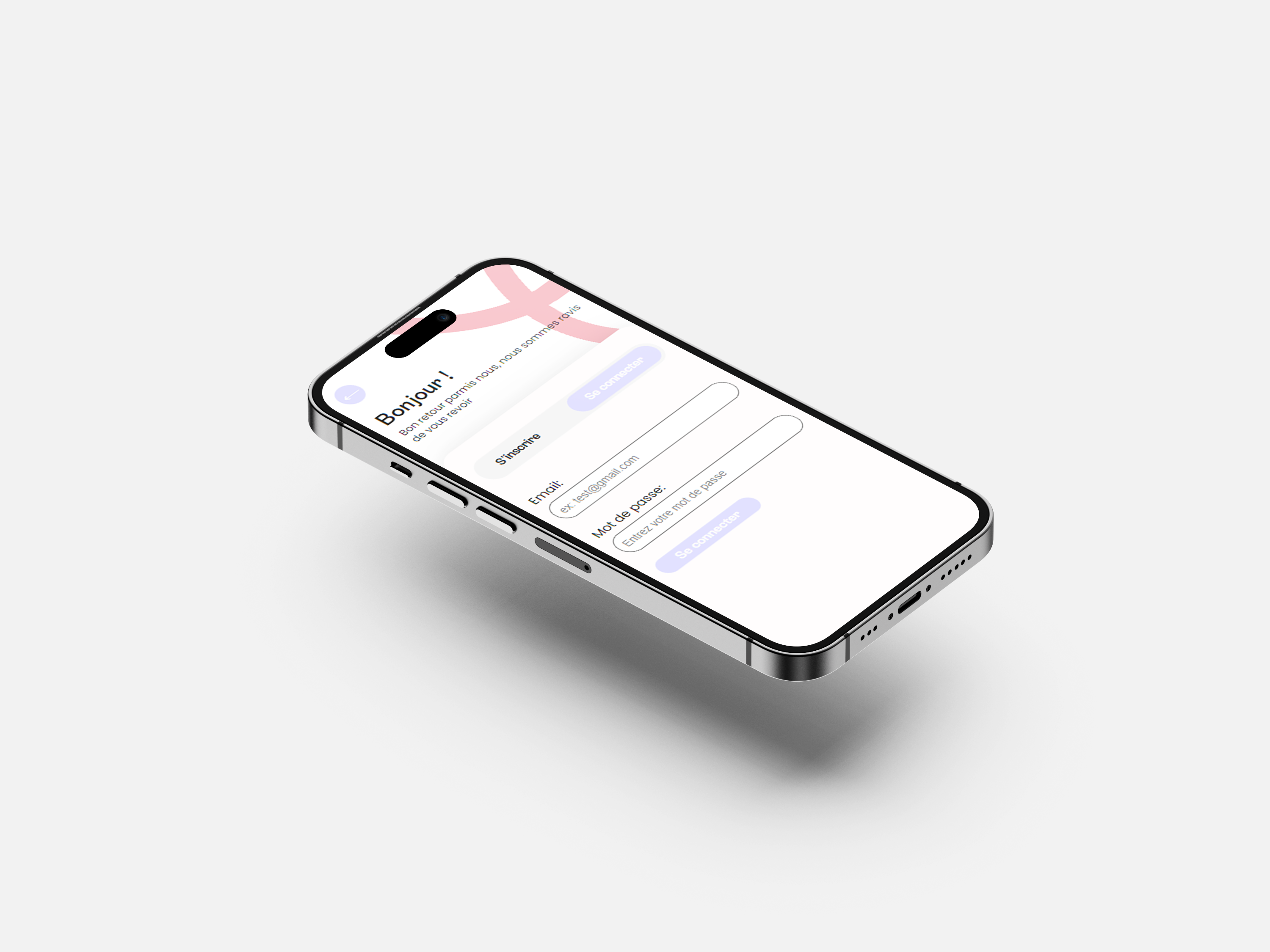
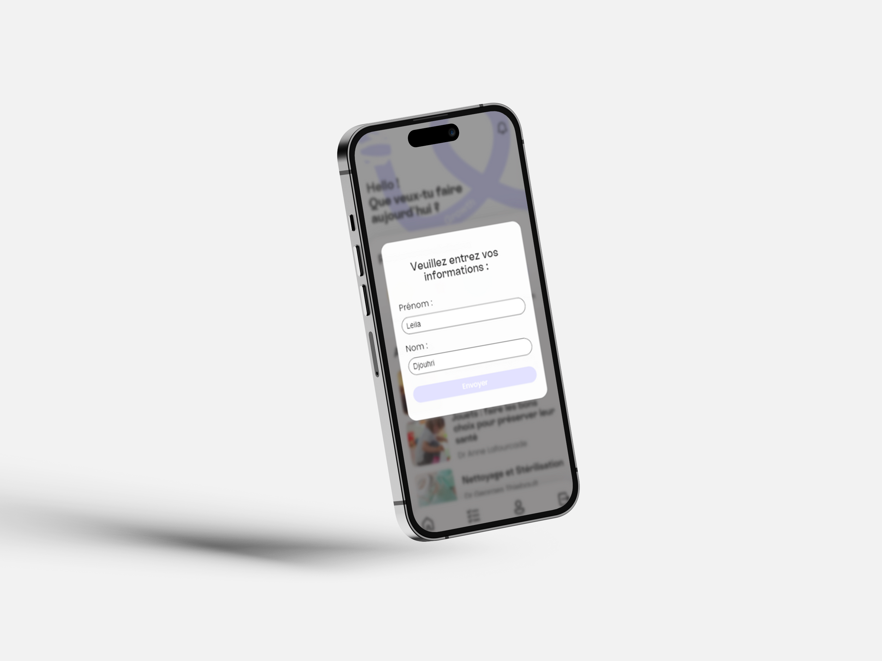
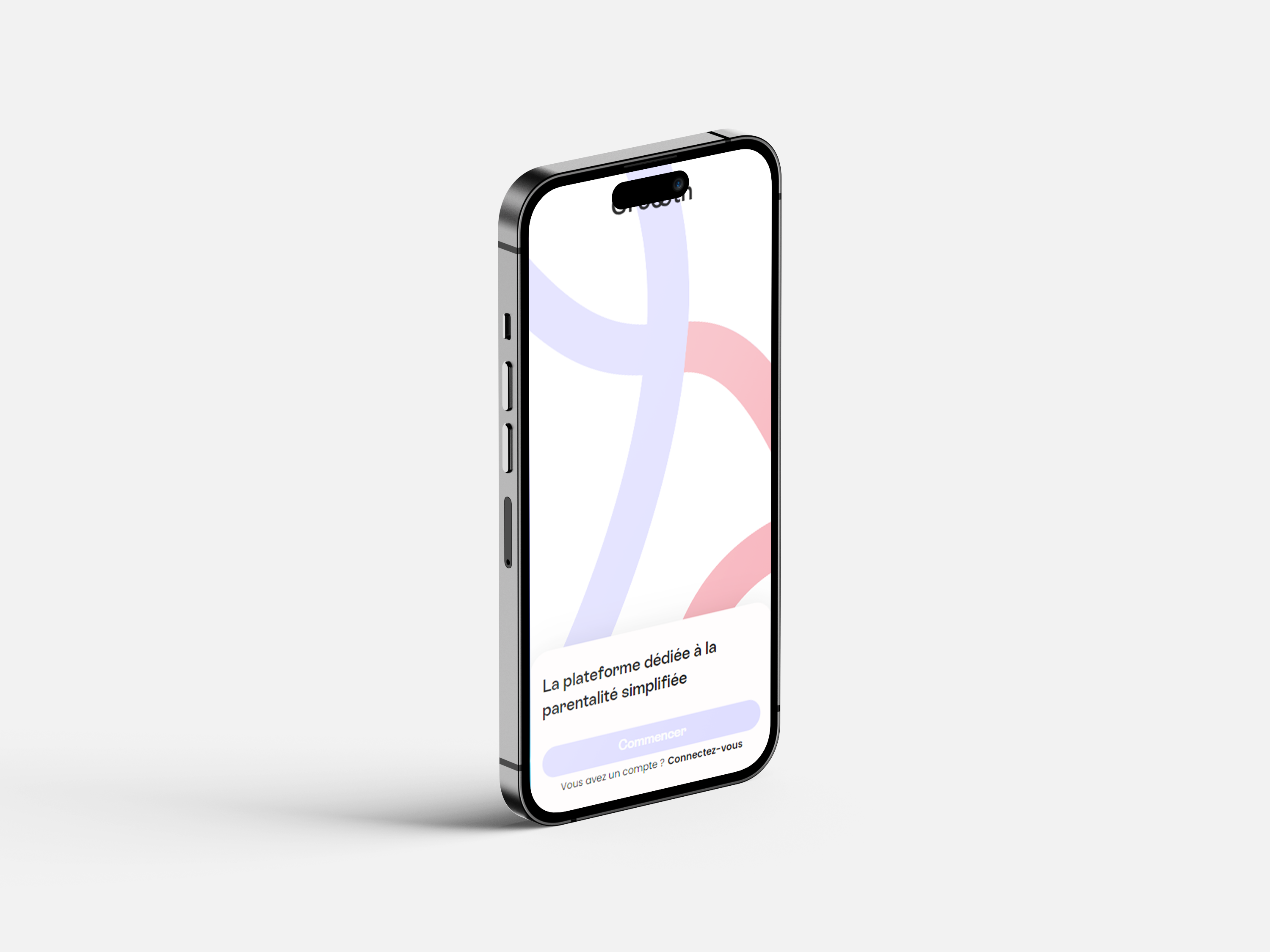
The project included the design and development of several key screens and features, including: Onboarding, Sign Up, Login, Home, Child Profile, Growth Tracking, Medical Notes, Articles, Notifications, Appointment Reminders, Settings, and Native Sharing.
Objectives
01 | Simplify Child Growth Monitoring
Allow parents to easily add, update, and follow key growth information such as height, weight, and development-related data.
02 | Centralize Family Health Information
Create a single mobile space where parents can access child profiles, medical notes, appointment details, and useful resources.
03 | Create a Reassuring Mobile Experience
Design a soft, intuitive, and trustworthy interface adapted to sensitive family and health-related information.
04 | Support Parents Between Medical Appointments
Help parents prepare for doctor visits, remember important questions, and avoid losing information between appointments.
Strategic Value
01 | Reduce Information Loss
Provide parents with a more accessible alternative to scattered notes, paper documents, and information stored across multiple devices.
02 | Improve Shared Parental Follow-Up
Support both parents in accessing the same key information directly from their phone, reducing communication gaps and duplicated tracking.
03 | Build Trust Through UX
Use clear design patterns, gentle visuals, and simple interactions to make parents feel confident using a digital tool for sensitive information.
The Challenge
Parents often need to remember multiple pieces of information between medical appointments: growth updates, symptoms, questions for the doctor, upcoming appointments, and recommendations related to their child's age.
However, this information can easily become scattered or forgotten:
Paper health records are not always accessible in everyday situations
Parents may track information separately on different devices
Important questions can be forgotten before a medical appointment
Growth data can be difficult to visualize over time
Health-related interfaces can feel too technical or intimidating
The challenge was therefore both functional and emotional:
How might we design a mobile experience that helps parents follow their child's development while feeling simple, reassuring, and trustworthy enough for everyday use?
Research et Exploration
The project started with a research phase focused on understanding how young parents organize and access information related to their children's development.
Methodologies
Benchmark Analysis
Analysis of existing baby tracking, family health, and digital health applications to identify useful features, UX patterns, and common limitations.
Personas
Creation of parent profiles to better understand daily needs, pain points, and expectations around child growth monitoring and medical organization.
User Flow
Mapping of the main user journey, from creating an account to adding a child profile, updating growth data, writing medical notes, and setting reminders.
Wireframing
Design of low-fidelity screens to structure the application, define navigation logic, and validate the main content hierarchy before visual design.
High-Fidelity Design
Creation of a soft and reassuring mobile interface using pastel colors, rounded components, clear typography, and simple interactions.
User Testing
Three usability tests were conducted to evaluate navigation clarity, ease of use, and the perceived trustworthiness of the interface.
Key Insights
User Needs Identified :
Quickly access child information during appointments
Keep medical notes in one organized place
Track height and weight evolution over time
Share useful articles or information with the other parent
Receive reminders for upcoming appointments
Design Opportunities :
Make health-related information feel less stressful
Reduce cognitive load through simple navigation
Use visual hierarchy to make important data easier to scan
Create a warm and trustworthy visual universe
Design a mobile-first experience adapted to daily use
Personas
Sarah, 29 | Young Mother Sarah has a young child and often writes down questions before medical appointments, but she sometimes forgets where she saved them. She needs a simple tool to centralize notes, growth updates, and reminders in one place.
Thomas, 34 | Involved Father Thomas wants to stay involved in his child's health follow-up, but information is often shared verbally or stored on his partner's phone. He needs quick access to the same information in order to follow appointments and development updates more easily.
Core Features
Child Profile
Parents can create and manage several child profiles with personal information, photos, and key details.
Growth Tracking
The application allows parents to add and follow height and weight information over time through a clear and accessible interface.
Medical Notes
A dedicated notes section helps parents prepare questions, remember symptoms, and keep important information before appointments.
Appointment Reminder
Parents can plan the next medical appointment and receive local notifications to avoid missing important follow-ups.
Technical
Implementation
Growth was developed using Next.js, Firebase, and Capacitor.
Next.js was used to build the application interface and manage the front-end logic, while Firebase handled authentication, user accounts, child profiles, images, articles, and growth-related data.
Capacitor was used to transform the web application into a native mobile experience and integrate mobile features such as local notifications, native sharing, and clipboard access.
This technical approach allowed me to combine UX/UI design with front-end development and mobile app deployment constraints.
Design Direction
The visual direction was designed to feel soft, reassuring, and accessible.
Since the application deals with family and health-related information, the interface needed to inspire trust without feeling overly medical or intimidating.
The design system uses light pastel colors, soft pink and lilac tones, rounded components, generous spacing, and Poppins typography.
The overall experience was built to feel warm, modern, and easy to use for young parents in everyday situations.
Outcomes
Functional Mobile Application
The project resulted in a testable mobile application developed from low-fidelity wireframes to a working product.
Simplified Health Follow-Up
Parents can centralize growth information, medical notes, reminders, and useful content in one accessible mobile experience.
Reassuring User Experience
The soft visual identity and clear interface help make sensitive information feel easier to manage and less stressful.
Stronger Product Thinking
The project allowed me to combine user research, mobile UX, interface design, database structure, and technical implementation into one complete product experience.
My Learnings
01 | Trust Is a Core Part of Health-Related UX
This project taught me that when users interact with personal or family-related information, the interface must feel clear, reliable, and reassuring from the first interaction.
02 | Mobile Navigation Must Feel Effortless
Designing for parents means designing for real-life situations. The application needed to be usable quickly, with simple navigation and minimal cognitive effort.
03 | UX/UI Can Make Sensitive Information Less Intimidating
Through soft colors, clear hierarchy, and simple wording, I learned how visual design can reduce stress and make health-related data feel more approachable.
04 | Building the Product Changed the Way I Designed
Working with Firebase and Capacitor helped me understand how technical constraints influence design decisions, especially around authentication, data structure, notifications, and native mobile behavior.
05 | A Complete Product Requires Both Vision and Execution
From research to development, this project helped me understand the full product lifecycle and strengthened my ability to think as both a UX/UI designer and a front-end developer.