ASTRO'VIZ
Visualizing the Evolution of Global Space Exploration Through Interactive Data Storytelling
Astro'Viz is an interactive data visualization project exploring the evolution of human space missions between 1965 and 2022.
Developed as part of a university Data Visualization project, the objective was to transform complex historical datasets into an intuitive and engaging visual experience.
By mapping astronauts according to their country of origin and allowing users to navigate through time, the project reveals how space exploration evolved from a Cold War rivalry between superpowers into a progressively more international effort.
The goal was not only to display data, but to make historical trends understandable through interactive storytelling and visual exploration.
Mission
As part of a team of three, my mission focused on UI design, data research, data cleaning, and front-end integration.
I contributed to transforming raw data collected from several sources into a coherent and visually accessible experience.
The project combined data analysis, interface design, and front-end development to create an interactive educational experience around the history of global space exploration.
Objectives
01 | Make Complex Data Understandable
Transform large historical datasets into a visual format that users can explore intuitively.
02 | Reveal Historical Trends
Help users understand how the geopolitical landscape of space exploration evolved between 1965 and 2022.
03 | Encourage Exploration
Create an interactive experience that invites users to discover patterns through navigation, interaction, and experimentation.
04 | Learn Data Visualization Methods
Apply data visualization principles to communicate information more effectively than traditional charts or tables.
Strategic Value
01 | Turn Data Into Knowledge
Allow users to understand relationships and trends that would be difficult to identify in raw datasets.
02 | Simplify a Complex Topic
Make the history of space exploration accessible to non-specialist audiences through visual storytelling.
03 | Combine Storytelling and Technology
Use interaction and animation to transform information into an engaging narrative experience.
The Challenge
The history of space exploration spans several decades and involves multiple countries, making the information difficult to understand through traditional static formats.
Several challenges emerged during the project: large quantities of historical data, multiple data sources, complex geopolitical context, difficulty visualizing evolution over time, and the need to communicate information to a broad audience.
The challenge was therefore both educational and technical:
How might we transform decades of space mission data into an interactive experience that clearly reveals the evolution of global space exploration?
Research et Exploration
Before designing the visualization, we conducted research to understand both the topic and the available data sources.
Methodologies
Data Research
Collection of astronaut and space mission data from historical sources, mainly Wikipedia archives covering different periods.
Data Cleaning
Verification, organization, and normalization of datasets to make them usable for visualization and interaction.
Data Analysis
Identification of recurring patterns, geopolitical shifts, and emerging countries involved in space exploration.
Benchmark Analysis
Study of existing data visualizations to identify effective interaction patterns and storytelling approaches.
Prototyping
Exploration of different ways to represent temporal and geographical data before selecting the interactive globe approach.
Key Insights
Historical Patterns :
Strong dominance of the United States and the Soviet Union during the Cold War
Space exploration initially concentrated around a small number of nations
Progressive emergence of new countries over time
Gradual democratization of space missions across multiple regions
Visualization Opportunities :
Represent geographical expansion visually
Highlight newly participating countries
Allow users to compare different periods
Reveal long-term trends through interaction
Make complex historical data more accessible
Core Features
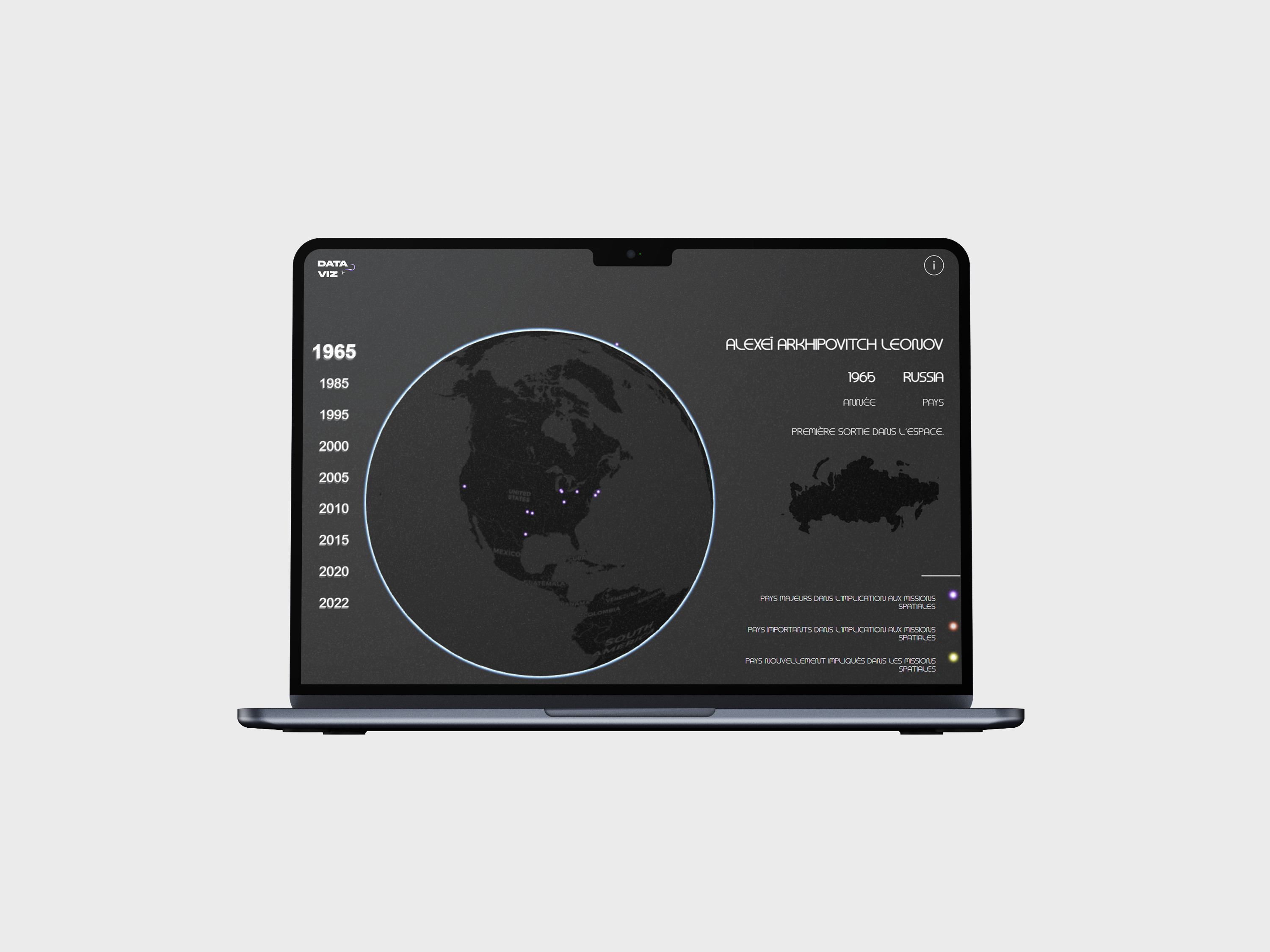
Interactive Globe
Users can rotate the globe to explore countries involved in space missions across different regions.
Timeline Navigation
A chronological selector allows users to visualize the evolution of space missions from 1965 to 2022.
Country Categorization
Countries are visually grouped according to their level of involvement in space missions.
Tooltips & Animations
Dynamic tooltips and animated transitions support exploration and make the experience more engaging.
Technical
Implementation
The project was developed using HTML, CSS, JavaScript, D3.js, and WebGL.
D3.js was used to manage data visualization and geographical rendering, while WebGL allowed us to create a performant and interactive globe experience.
My work focused on UI design, front-end integration, data preparation, and making sure the visualization remained readable despite the complexity of the dataset.
This project helped me explore a more advanced use of front-end technologies applied to data storytelling.
Design Direction
The visual direction was intentionally sober, modern, and focused on the data itself.
The interface uses a dark visual universe with black and grey backgrounds, white typography, and subtle contrast to reinforce the connection with space exploration.
The goal was to create an immersive but readable interface, where the globe remains the main visual element and the timeline guides users through the evolution of the story.
Outcomes
Better Understanding of Space History
Users can identify major geopolitical shifts in space exploration through visual exploration.
Clear Visualization of Global Expansion
The interface highlights the gradual democratization of space missions across multiple countries.
Interactive Learning Experience
The project transforms static historical data into a dynamic and educational exploration tool.
Successful Combination of Data and Design
The final result demonstrates how design can make complex information more accessible and engaging.
My Learnings
01 | Data Alone Doesn't Tell a Story
Raw datasets become meaningful only when organized into a narrative users can understand.
02 | Visualization Is a Design Discipline
Data visualization requires balancing aesthetics, clarity, and information density.
03 | Cleaning Data Is As Important As Displaying It
A large part of the project involved validating, organizing, and structuring information before any design work could begin.
04 | Interaction Helps Understanding
Allowing users to manipulate data themselves creates stronger engagement and deeper comprehension.
05 | Technology Can Simplify Complexity
Working with D3.js and WebGL showed me how advanced front-end technologies can transform large datasets into intuitive visual experiences.