COMMUNICATION OF IUT VELIZY
Redesigning an Internal Communication Ecosystem for Students, Teachers and Administration
Communication of IUT Vélizy is a university group project focused on redesigning the internal communication system of the IUT de Vélizy.
The objective was to improve the circulation of information between students, teachers and administration by creating a clearer, more coherent and more accessible communication ecosystem.
The project combined communication strategy, UX/UI design, graphic design and editorial planning to rethink how institutional information could be distributed across multiple channels.
Our final proposal included a complete communication strategy, ready-to-use visual supports and a functional Figma prototype.
Mission
As part of a team of three, I worked on UX/UI design, communication strategy, graphic design and visual content creation.
Together, we redesigned the internal communication experience by combining digital tools, printed supports, social media content, newsletters and editorial organization.
The project included several deliverables: social media posts, posters, flyers, newsletters, a mobile web app, an editorial calendar, a graphic charter and a functional Figma prototype.
Objectives
01 | Centralize Institutional Information
Create a clearer communication system where students, teachers and administration can access the right information more easily.
02 | Improve Visibility
Make important announcements, events and institutional messages more visible across physical and digital channels.
03 | Modernize the Visual Identity
Design a more dynamic and recognizable communication system aligned with the needs of a student audience.
04 | Structure Editorial Planning
Introduce a clearer publication rhythm through a dedicated editorial calendar and reusable communication templates.
Strategic Value
01 | Reduce Information Fragmentation
Limit the dispersion of important messages by creating a more organized communication ecosystem.
02 | Strengthen Engagement
Use modern visual formats and multi-channel communication to better reach students and encourage interaction.
03 | Support Institutional Clarity
Make communication more understandable, consistent and useful for students, teachers and administrative teams.
The Challenge
The existing communication system presented several limitations: information was scattered across different channels, important messages lacked visibility, students were not always well informed, visual supports were inconsistent and the tone felt too institutional.
These issues made it harder for students, teachers and administration to access and share relevant information efficiently.
The challenge was therefore both strategic and visual:
How might we create a clearer and more engaging communication system that makes institutional information easier to access, understand and remember?
Research et Exploration
The project started with an analysis of the existing communication system in order to identify pain points, user expectations and opportunities for improvement.
Methodologies
Communication Audit
Analysis of the existing internal communication channels, visual supports and editorial organization.
Questionnaire
Collection of feedback from users to better understand how students and staff members receive and search for information.
Benchmark Analysis
Study of institutional and student-oriented communication systems to identify relevant formats and best practices.
Personas
Creation of user profiles representing students, teachers and administration in order to adapt the communication strategy to their needs.
Moodboard Creation
Definition of a visual direction focused on clarity, modernity, dynamism and institutional credibility.
Key Insights
Problems Identified :
Information was scattered across multiple channels
Important messages lacked visibility
Students were not always well informed
Communication supports lacked consistency
The institutional tone felt too formal and distant
Design Opportunities :
Create a stronger visual identity
Centralize information through a mobile web app
Use social media to reach students more effectively
Introduce reusable templates for recurring communication
Structure publications through an editorial calendar
Deliverables
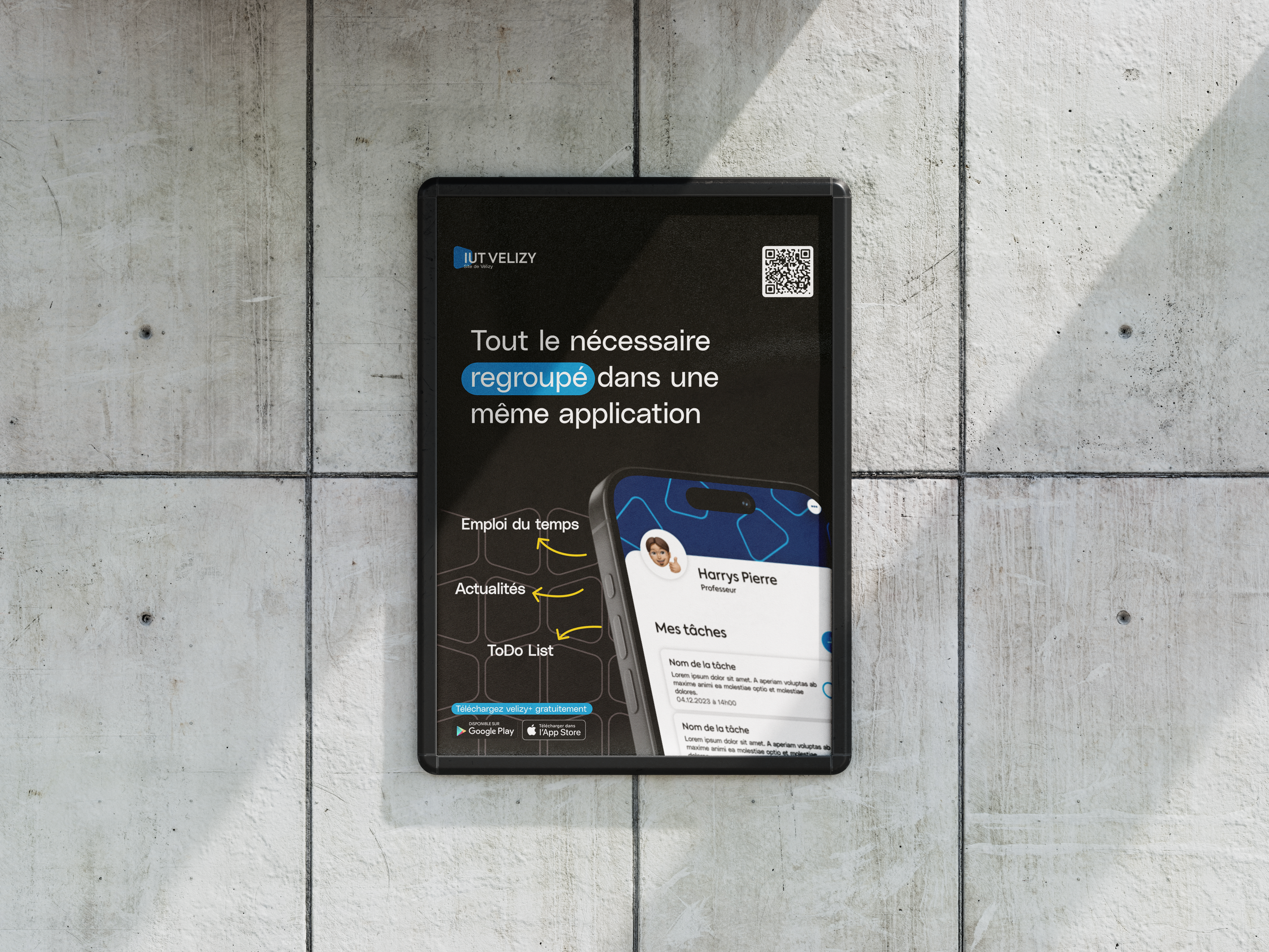
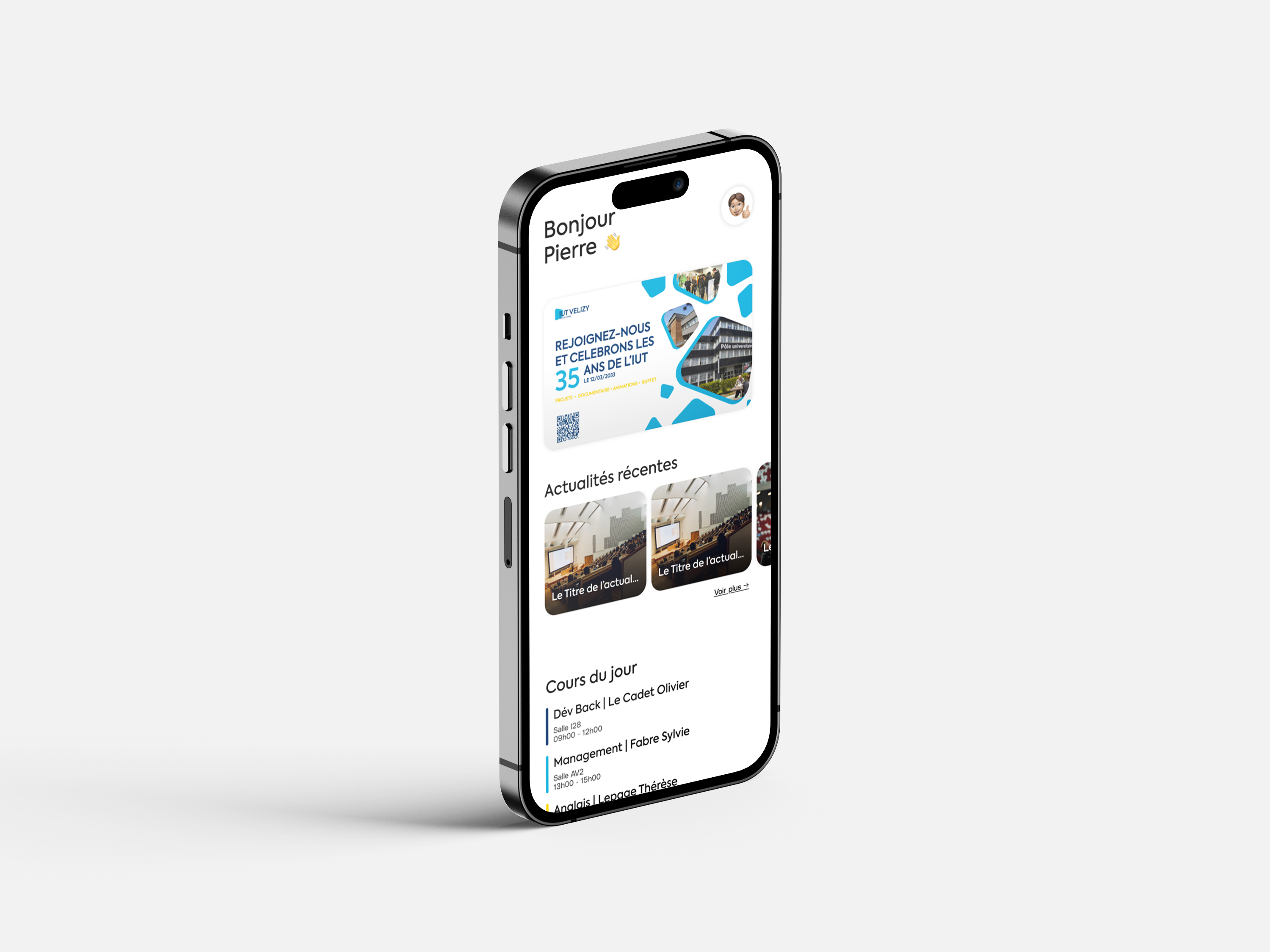
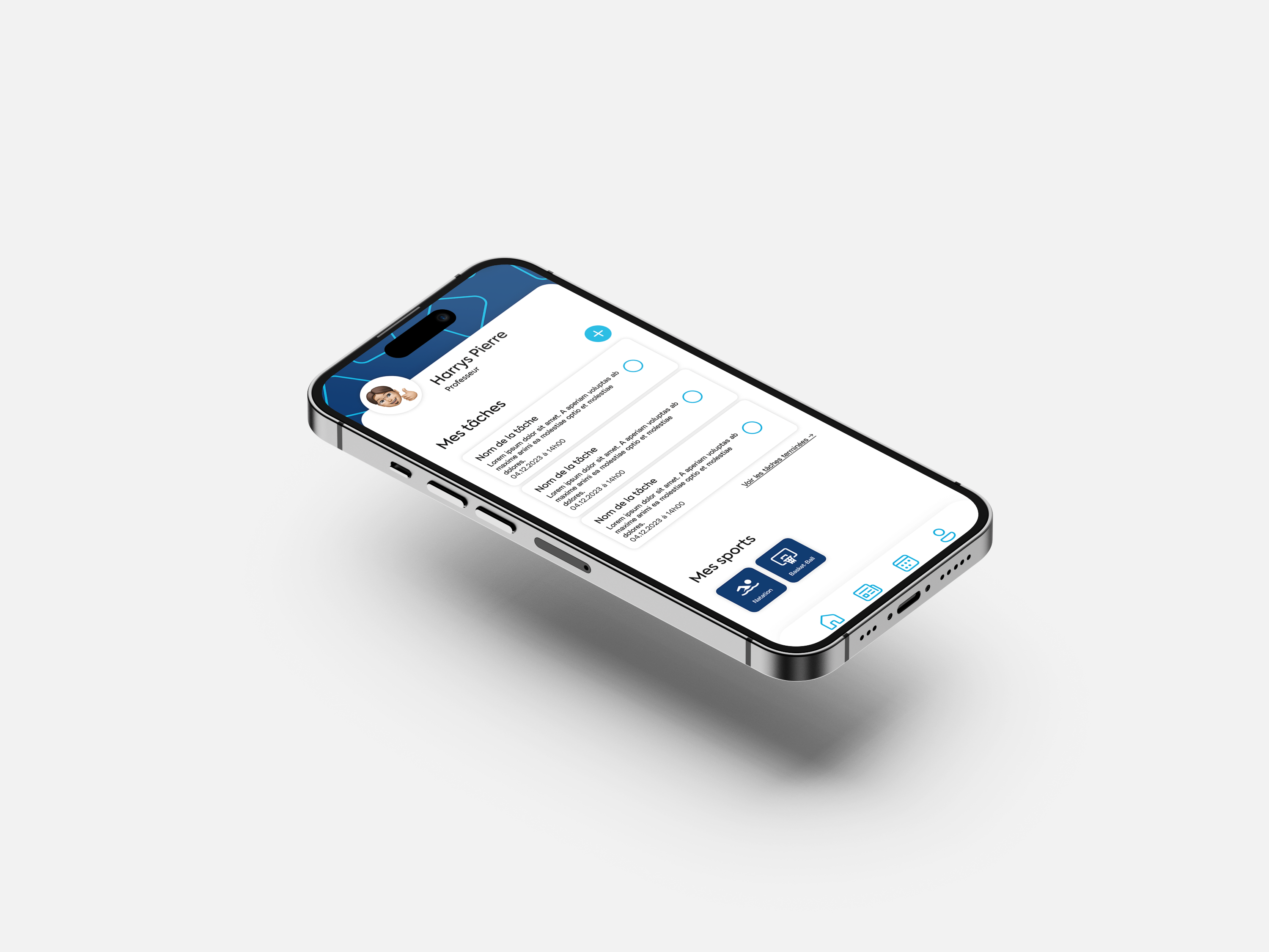
Mobile Web App
A functional Figma prototype designed to centralize information and make internal communication easier to access.
Social Media Posts
Modern visual templates created to improve engagement and adapt communication to student habits.
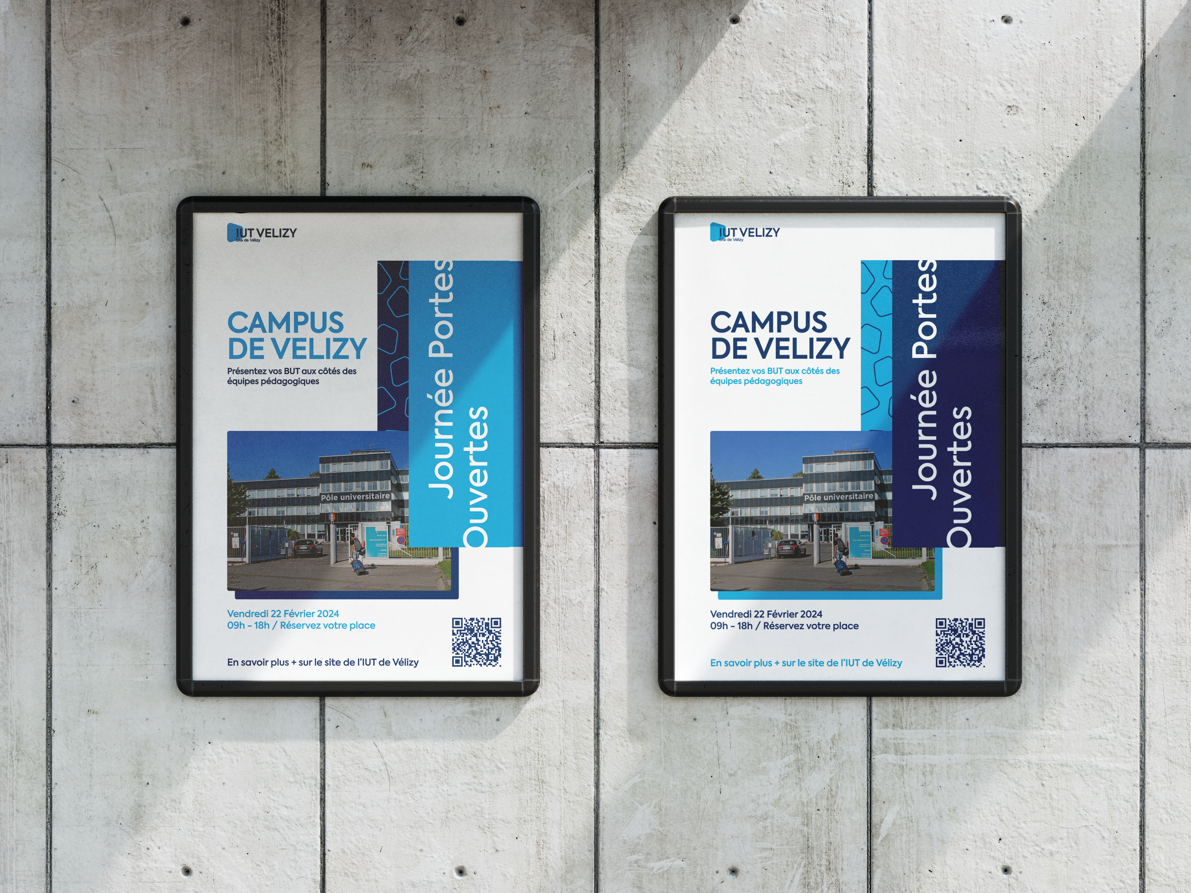
Printed Supports
Posters and flyers designed to reinforce communication visibility across the campus.
Editorial System
A newsletter structure, editorial calendar and graphic charter created to ensure long-term consistency.
Design Direction
The visual direction was designed to feel modern, dynamic and accessible while remaining appropriate for an institutional context.
The graphic universe uses light blue, dark blue and yellow to create a recognizable identity that feels both serious and energetic.
The objective was to move away from overly formal communication by creating clearer, more visual and more engaging supports for students, teachers and administration.
The system was designed to remain flexible across social media, print, newsletters and mobile interfaces.
Outcomes
Complete Communication Strategy
The final project presented a structured strategy covering digital, print and editorial communication.
Functional Figma Prototype
The mobile web app prototype demonstrated how information could be centralized and accessed more easily.
Ready-to-Use Supports
The project included social media posts, posters, flyers, newsletters and templates ready to be deployed.
Stronger Visual Coherence
The new graphic charter created a consistent identity across all communication touchpoints.
My Learnings
01 | Communication Strategy Is Also UX
This project taught me that improving communication is not only about visuals. It is about making information easier to find, understand and act on.
02 | Multi-Channel Consistency Builds Recognition
Designing for social media, print, newsletters and mobile interfaces helped me understand the importance of visual coherence across every touchpoint.
03 | Institutional Design Can Still Be Dynamic
I learned how to balance credibility and creativity by designing communication supports that feel modern without losing institutional seriousness.
04 | Editorial Planning Improves Clarity
Structuring content through an editorial calendar helped us create a more regular, predictable and efficient communication rhythm.
05 | Accessibility of Information Is a Design Responsibility
This project reinforced the idea that designers can directly improve how people access important information in their daily environment.