THE OAK COLLECTION
Designing a Premium Institutional Campaign for a Watch Exhibition at the Design Museum
The Oak Collection is an institutional campaign concept created for a watch exhibition at the Design Museum in London.
Developed as part of a university project, the objective was to design a coherent visual campaign for a cultural location or event of our choice.
We chose the Design Museum because of its strong connection to contemporary design, product culture, and visual experimentation. The watch exhibition offered an interesting opportunity to explore the relationship between time, precision, craftsmanship, and premium object design.
The project focused on creating a luxury-inspired campaign that could promote the exhibition across several communication formats while maintaining a consistent and memorable visual identity.
Mission
Working as a duo, my mission was to contribute to the art direction, graphic design, and UI design of the campaign.
Together, we designed the campaign visuals across different formats, including the main exhibition poster, advertising banners, and a website mockup presenting the collection.
The project required us to create a cohesive visual identity that could adapt to both print and digital supports while communicating the premium and refined nature of the exhibition.
Objectives
01 | Promote the Exhibition
Create a strong campaign concept capable of attracting visitors to a watch exhibition hosted by the Design Museum.
02 | Build a Premium Visual Universe
Translate the values of watchmaking , precision, elegance, craftsmanship, and exclusivity , into a distinctive graphic direction.
03 | Ensure Cross-Format Consistency
Design a campaign that remains coherent across posters, advertising banners, and a digital exhibition page.
04 | Balance Culture and Luxury
Create a visual identity that feels refined and desirable while still fitting the institutional context of a museum.
Strategic Value
01 | Create Desire Around a Cultural Event
Use visual storytelling to make the exhibition feel exclusive, attractive, and worth discovering.
02 | Strengthen Exhibition Recognition
Develop a clear and memorable campaign identity that can be recognized across multiple supports.
03 | Connect Object Design and Museum Experience
Position the watches not only as luxury products, but as design objects worthy of cultural attention.
The Challenge
Designing a campaign for a museum exhibition required balancing two different worlds: the institutional credibility of a cultural venue and the premium codes of watchmaking.
Several challenges guided the project: creating a strong visual impact, keeping the message clear, adapting the identity to several formats, and making the collection feel both elegant and culturally relevant.
The challenge was therefore both visual and strategic:
How might we design a premium campaign that promotes a watch exhibition while preserving the cultural and institutional identity of the Design Museum?
Research et Exploration
Before designing the campaign, we explored both museum communication codes and luxury watchmaking visual universes.
Methodologies
Museum Campaign Benchmark
Analysis of cultural and institutional campaigns to understand how museums communicate exhibitions across print and digital formats.
Watch Brand Benchmark
Research into premium watch brands to identify recurring luxury codes such as contrast, precision, minimalism, detail, and product focus.
Moodboard Creation
Development of a visual moodboard combining museum aesthetics, premium product photography, elegant typography, and refined compositions.
Visual Exploration
Testing several poster compositions, image treatments, typographic balances, and layout systems before defining the final campaign direction.
Digital Mockup
Creation of a website mockup in Figma to present the exhibition online and extend the campaign identity into a digital experience.
Key Insights
Communication Needs :
The campaign needed to feel refined and visually impactful
The exhibition had to be understandable at first glance
The identity needed to adapt across print and digital formats
The watch had to be presented as both a product and a design object
The visual universe had to remain credible within a museum context
Design Opportunities :
Use premium visual codes to create desire
Work with contrast and negative space to highlight the object
Build a strong hierarchy between title, image, and information
Create a campaign identity that feels elegant and memorable
Translate the poster direction into a digital exhibition page
Deliverables
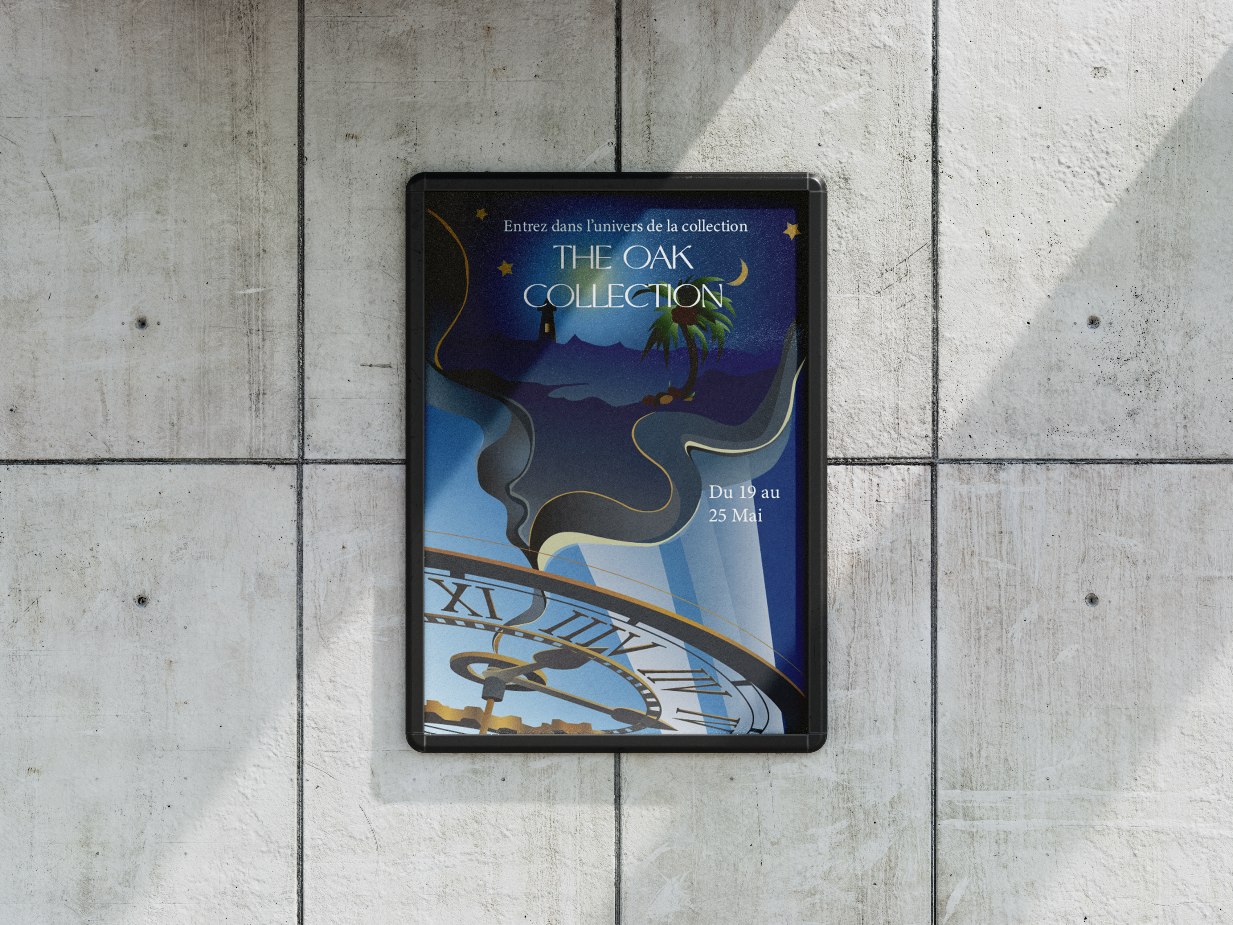
Main Poster
A premium exhibition poster designed to introduce the collection and create a strong first impression.
Advertising Banners
Two campaign banners adapted from the main visual direction for promotional communication.
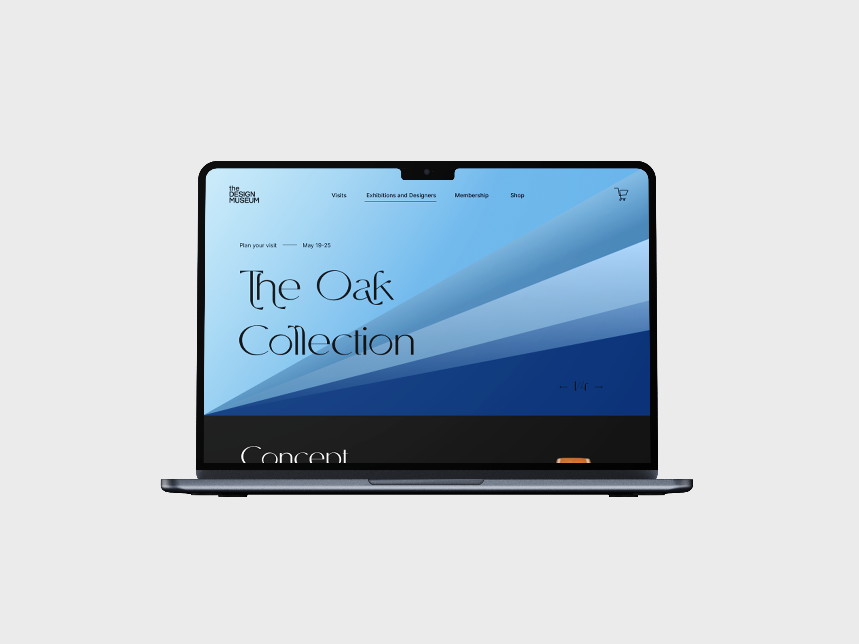
Exhibition Web Page
A Figma mockup presenting the collection online while extending the campaign’s visual identity into a digital format.
Visual Guidelines
A coherent graphic direction based on luxury codes, refined compositions, and strong visual hierarchy.
Design Direction
The visual direction was built around a premium and luxury-inspired universe.
The campaign aimed to express precision, elegance, exclusivity, and craftsmanship while remaining aligned with the cultural positioning of the Design Museum.
The compositions relied on strong visual hierarchy, refined typography, controlled spacing, and a careful balance between product focus and institutional information.
The objective was to make the watch feel like a design object, not only a commercial product.
Tools
The poster and advertising banners were designed using Adobe Photoshop and Adobe Illustrator.
These tools allowed us to work on image composition, layout, visual balance, and graphic treatments.
The exhibition website mockup was created in Figma, allowing us to translate the campaign identity into a structured digital interface.
Outcomes
Coherent Campaign System
The project resulted in a complete visual campaign across poster, advertising banners, and digital mockup.
Premium Visual Identity
The final direction communicates elegance, precision, and exclusivity through a refined graphic universe.
Cross-Format Adaptability
The campaign identity remains consistent across both print and digital communication supports.
Stronger Visual Storytelling
The project demonstrates how a single object can be transformed into a compelling exhibition narrative.
My Learnings
01 | A Campaign Must Work as a System
This project taught me that a campaign is not only one strong visual. It must remain recognizable and coherent across several formats.
02 | Visual Hierarchy Drives Understanding
Working on posters and banners helped me understand how typography, spacing, and image placement influence how quickly a message is understood.
03 | Luxury Codes Require Precision
Premium design relies on restraint, balance, detail, and consistency. Every element must feel intentional.
04 | The Same Story Must Adapt to Each Format
An exhibition campaign must communicate differently on a poster, a banner, and a website while keeping the same central identity.
05 | Posters Can Tell Stories
This project helped me understand how a poster can do more than inform. It can create desire, atmosphere, and curiosity around an event.